Dirt Doesn't Vote: Part II
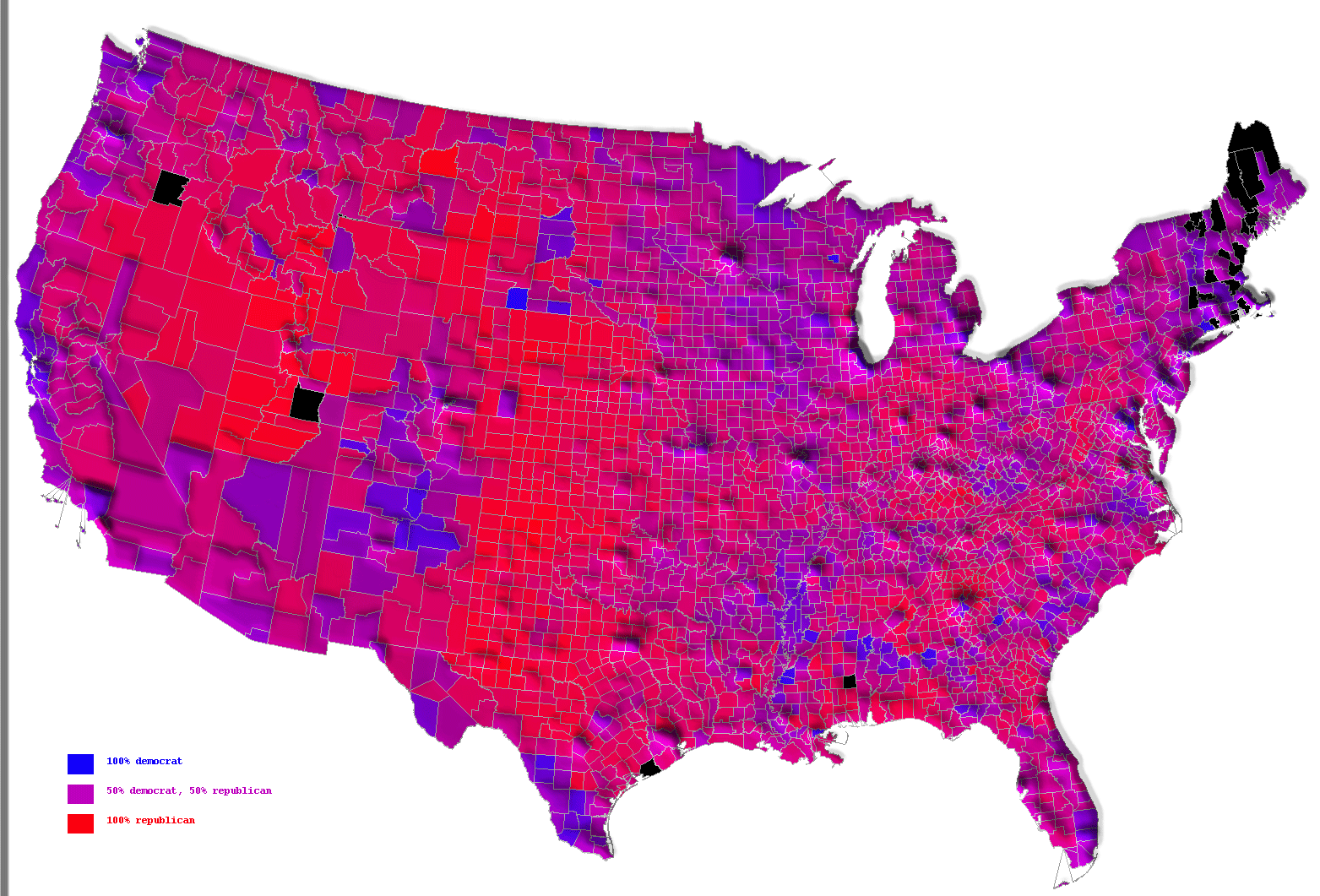
Here is a cool graphic that illustrates the vote in terms of percentages by county. Note that some "red" counties have a lot of blue in them and vice versa. Here is the same map with a vertical dimesion for population density. And here is a state-level version (without the vertical dimension).
This is a fascinating picture of the country but, as I said in my previous post, the only numbers that matter are the electoral votes. And we won those.
Update: Thanks to Daimien for the link to the state-level map and to the commentors on Michael Totten's page for the county-level ones.


No comments:
Post a Comment